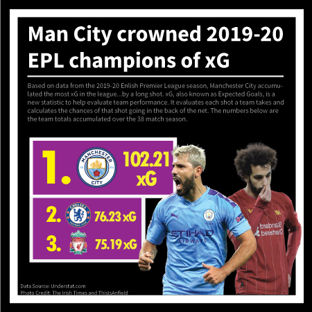
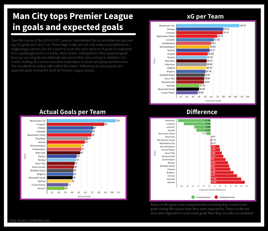
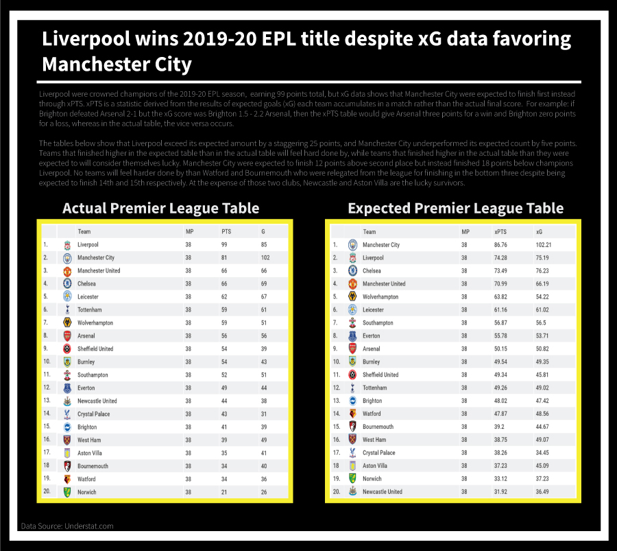
Rationale
This project headlines the 2019-20 English Premier League season that really took bizarreness to another level. With my design, I wanted to show the uncanniness that was Liverpool completely running away with the league despite xG data favoring Manchester City. I used Understat.com to get my statistics, the xG Philosophy book and other background knowledge about the English Premier League to comprehend the data and Adobe Illustrator and Infogram to create the visualizations. Illustrator for the design and Infogram for the graphs. This project taught me how to work with data better (aka find the right data) and display said data competently (and accordingly), and in particular the project was a real breakthrough for me in overall digital design.
